The best subtitle font is a plain sans serif with open shapes and letters you can't mix up. Pick Arial or Helvetica if you want a font that's already on your computer, Roboto, Open Sans or Inter if you want a free one, Atkinson Hyperlegible for the clearest letters, and Noto Sans for many languages. Use white text with a dark outline or box, and keep each subtitle to two lines of about 42 characters. One catch: the font only stays fixed when captions are burned into the video. An SRT file has no font at all.
The short answer by situation
| Your situation | Font to pick | Where you set it |
|---|---|---|
| Captions burned into social clips (Shorts, Reels, TikTok) | Roboto, Open Sans or Inter, medium or bold | The caption style in your video editor |
| Training, company or course videos | Arial, or Helvetica on a Mac | The caption style in your video editor |
| Viewers with low vision, or text full of codes and names | Atkinson Hyperlegible | The caption style in your video editor |
| Videos in several languages or scripts | Noto Sans, plus the Noto font for each script | The caption style in your video editor |
| An SRT file for YouTube or another platform | None: the file can't carry a font | The viewer's caption settings |
| A VTT file on your own website | A font list such as Verdana, Arial, sans-serif | A STYLE block in the file or your site's CSS |
Size, contrast, line length and timing do more for readability than the choice between two good sans serif fonts. The checklist sums them up; details follow below.
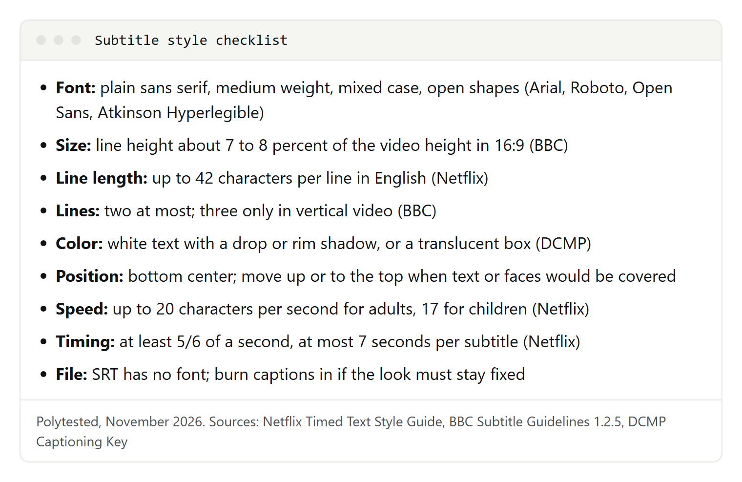
What makes a font readable as subtitles
Subtitles are read in a second or two, over a moving picture, on anything from a phone to a TV across the room. That asks for:
- Simple, open shapes. The DCMP Captioning Key, the caption guide of the US Described and Captioned Media Program, asks for a medium-weight, sans serif, proportionally spaced font with a drop or rim shadow.
- Letters you can't confuse. Capital I, small l and the number 1 should look different, and so should O and 0. Microsoft's description of Verdana names these pairs as the ones a screen font must keep apart.
- Upper and lower case. DCMP prefers mixed case, with real descenders on g, p and y, and keeps capitals for shouting.
- A middle weight. Thin strokes get lost over a busy picture; very heavy weights close up at small sizes.
- The right width. Wide fonts read easily but fit fewer characters. The BBC has its subtitlers work in a wide font, so the narrower font a player often uses will still fit.
- Every character you need. Accents and other scripts must be in the font, or they turn into boxes.
So skip script fonts, condensed and ultra-thin cuts, decorative display fonts, and serifs with fine hairlines.
How we chose: each font below is a sans serif with open shapes and distinct letters, is free under an open licence or included with Windows or macOS, and has an official page stating its licence and design. Where a subtitle guide names a font, we say so. We didn't rank them: the right one depends on your platform, languages and audience.
The 9 best fonts for subtitles
Arial
The safe default. Netflix's English (USA) style guide uses Arial as the placeholder for the generic "proportional sans serif" family, in white, scaled so 42 characters fit across the screen. Robin Nicholas designed it at Monotype in 1982; Microsoft licensed it for Windows 3.1 in 1992.
Licence: included with Windows and, per Apple's font list, macOS Tahoe; Microsoft doesn't offer it as a separate download.
Helvetica and Helvetica Neue
The other classic neutral sans serif. The BBC's guidelines say online subtitles generally read better in the device's system font and name Helvetica for iOS. Apple lists Helvetica and Helvetica Neue among the fonts included with macOS Tahoe.
Licence: comes with Apple devices. If you share project files with Windows users, check that they have it, or pick Arial.
Verdana
Matthew Carter designed Verdana for the computer screen; Microsoft first released it in July 1996. Its generous width and spacing keep letters from touching, and i, j, l, I, J, L and 1 are drawn to be as distinct as possible. The BBC names it as a wide font to write subtitles in.
Licence: included with Windows and macOS Tahoe. Watch out: fewer characters fit on a line, so shorten lines rather than shrinking the size.
Roboto
Christian Robertson's Roboto pairs a geometric skeleton with open curves and lets each letter keep its natural width. The BBC names it as the Android system font. It covers Latin, Cyrillic, Greek and Vietnamese, among others, and has a variable version with weight and width axes.
Licence: SIL Open Font License (OFL), free on Google Fonts.
Open Sans
Steve Matteson designed Open Sans as a humanist sans serif with upright stress and open forms, optimized for print, web and mobile. Its character set includes Latin, Greek, Cyrillic and Hebrew, and Google Fonts describes its letterforms as highly legible.
Licence: OFL, free on Google Fonts.
Inter
Rasmus Andersson designed Inter for computer screens. Its tall x-height (tall lower-case letters) keeps small mixed-case text readable, and an optional slashed zero separates 0 from o, if your editor supports OpenType features.
Licence: OFL, free on Google Fonts. Watch out: over busy footage, use a medium weight or an outline.
Source Sans 3
Adobe's first open source typeface family, designed by Paul D. Hunt to work well in user interfaces; Source Sans 3 is the current name of Source Sans Pro. Its plain, even letters suit tutorials and screen recordings.
Licence: OFL, free on Google Fonts and from Adobe's GitHub repository.
Noto Sans
Noto is Google's font collection for all modern and ancient languages. Noto Sans covers Latin, Cyrillic and Greek with 3,741 glyphs and is designed to sit alongside the Noto Sans fonts for other scripts, such as Arabic, Devanagari or Japanese.
Licence: OFL, free on Google Fonts.
Atkinson Hyperlegible
The Braille Institute created it in 2019 for readers with low vision. It starts from a classic grotesque sans serif and makes similar characters deliberately different: 1, I, i and l, B and 8, O and 0. Atkinson Hyperlegible Next (2025) has seven weights plus a variable font and supports more than 150 languages, against 27 for the original.
Licence: the Braille Institute calls it free for personal and all commercial use; Google Fonts lists both versions under the OFL.
Fonts you'll read about but probably won't use
- Tiresias Screenfont. The BBC's guidelines say its DVB broadcast subtitles are drawn as images in Tiresias, and the HbbTV standard maps the default font to it. It's a font for broadcast systems, not video editors.
- BBC Reith Sans. The BBC introduced Reith in 2018 as its very own typeface family and now names Reith Sans for writing subtitles.
- "The Netflix font." Some pages claim Netflix subtitles use a brand font or even a monospaced one. Netflix's style guide names no brand font, only Arial as a placeholder.
- "The YouTube font." You'll also read that YouTube's default is a weight of Roboto. YouTube's help doesn't name a default, and viewers can change the font anyway.
- Generic caption styles. US rules require TV caption decoders to let viewers choose among eight styles: default, monospaced serif (similar to Courier), proportional serif (similar to Times New Roman), monospaced sans serif, proportional sans serif (similar to Arial), casual, cursive and small capitals. If your TV's caption menu shows names like these, that's where they come from.
The nine fonts side by side
| Font | Licence | Why it reads well | Watch out |
|---|---|---|---|
| Arial | System font (Windows, macOS) | Neutral; Netflix's placeholder | Narrower than Verdana |
| Helvetica | System font (macOS, iOS) | Neutral, compact | Check Windows users have it |
| Verdana | System font (Windows, macOS) | Wide, distinct letters, made for screens | Fewer characters per line |
| Roboto | OFL | Open curves, natural widths | Light weights too thin |
| Open Sans | OFL | Open forms, upright stress | Use semibold over bright scenes |
| Inter | OFL | Tall lower case, slashed zero | Medium weight over busy footage |
| Source Sans 3 | OFL | Plain letters made for interfaces | Semibold or bold over video |
| Noto Sans | OFL | Matching fonts for many scripts | One Noto font per script |
| Atkinson Hyperlegible | OFL, or Braille Institute's free licence | Similar letters made different | Distinctive look |
Size, line length and number of lines
Subtitle size is measured against the picture, not in points. The BBC's guidelines (version 1.2.5, March 2026) ask for a line height of 7 to 8 percent of the video height for landscape, 4:3 and square video, and 3.9 to 4.5 percent for vertical 9:16 video. On a 1080-pixel-high landscape video, that's about 76 to 86 pixels per line, spacing included. Players may scale it to 0.6 to 0.8 times on most screens, but small phones should get the full size. Netflix instead scales the font so that 42 characters fit across the screen.
| Rule | Netflix (English, USA) | BBC Subtitle Guidelines | DCMP Captioning Key |
|---|---|---|---|
| Size | Scaled to fit 42 characters across | Line height 7 to 8 percent of video height; 3.9 to 4.5 percent for vertical | Not set as a number |
| Characters per line | 42 | 37 on broadcast Teletext | Not set |
| Line width online | Not set | 68 percent of the width in 16:9; 90 percent in 4:3, square and vertical | Not set |
| Lines per subtitle | Two at most | Two for landscape and square, three for vertical | No more than two preferred |
Character counts are only a guide with proportional fonts; the BBC notes that "lilly" takes less room than "mummy". When you break a line, keep units together: Netflix asks you to break after punctuation or before a conjunction or preposition, never between an article and its noun or a first and last name, and to prefer a bottom-heavy pyramid shape.
Color, outline, background box and position
Color. White is the standard: Netflix specifies it, DCMP prefers it, and the BBC writes most subtitles in white on black. The BBC adds yellow, cyan and green, in that order, mainly to tell speakers apart, always on black.
Outline, shadow or box. White text needs something dark around it. DCMP asks for a drop or rim shadow and prefers a translucent box, especially over light scenes. The W3C's media accessibility requirements add that a thicker outline or shadow helps but isn't a general substitute for a solid background.
Position. Bottom center is the convention. Move subtitles up, or to the top, when they would cover on-screen text, a speaker's mouth or other key action; Netflix and the BBC both say so. The FCC's caption quality rule for US TV adds that captions must not block faces, featured text or graphics, overlap, or run off the screen edge. For vertical video, the BBC places subtitles a little higher, still in the lower third, because faces sit in the top half. Keep a margin to the edges: the BBC notes that TVs traditionally cut off the edges of the picture.
Reading speed and timing
The guides set these limits:
- Netflix: up to 20 characters per second for adult programs and 17 for children's (English, USA); each subtitle at least 5/6 of a second and at most 7 seconds on screen.
- BBC: 160 to 180 words per minute, roughly 0.3 seconds per word.
- DCMP: 130, 140 or 160 words per minute depending on the audience's educational level, and at least 40 frames, which is 1 second and 10 frames.
If subtitles run too fast, shorten the text rather than shrinking the font. If they're early or late, see our guide to syncing subtitles.
Where you can choose the font, and where you can't
Whether your font reaches the viewer depends on how the subtitles travel.
| How the subtitles travel | Font in the file? | Who decides what viewers see |
|---|---|---|
| Burned in (open captions) | Yes, it's part of the picture | You; viewers can't change or hide it |
| SRT | No: only numbers, timecodes and text | The player and the viewer's settings |
| VTT (WebVTT) | Optional, as CSS in a STYLE block | The browser or player; YouTube uses only bold, italic and underline |
| ASS or SSA | A font name in each style | The player, which needs that font |
| TTML or DFXP | Styling attributes | The player; YouTube supports TTML styling and positioning |
| SCC (US TV, CEA-608) | No: the TV's decoder draws the text | The TV or decoder, and the viewer |
YouTube's help on supported files is explicit: SRT files must be plain UTF-8, and no style markup in them is recognized. In WebVTT files, YouTube supports positioning but limits styling to bold, italic and underline. So if your brand font must appear on YouTube, burn the captions in; if you'd rather give viewers captions they can switch off and restyle, upload an SRT. What an SRT file contains is in our separate guide, and if you start from a plain transcript, see how to convert TXT to SRT. Burned-in captions are open captions; which kind your viewers need is explained in subtitles vs closed captions.
How to style a VTT file
WebVTT is the common subtitle format that can carry CSS. A STYLE block goes after the header and before the first cue, with no blank lines inside. ::cue styles all cues, and ::cue(.name) styles text wrapped in a class tag such as <c.name>:
WEBVTT

STYLE
::cue {
  font-family: "Atkinson Hyperlegible", Verdana, Arial, sans-serif;
  color: #ffffff;
  background-color: rgb(0 0 0 / 75%);
}
::cue(.second) {
  color: #ffff00;
}

00:00:01.000 --> 00:00:04.200 line:85% align:center
Welcome back. Today: three ways
to keep your captions readable.

00:00:04.600 --> 00:00:07.000
<c.second>Can viewers still change the font?</c>- Only some CSS works. MDN lists the properties allowed in
::cue, among themcolor, thefontproperties,background,outline,text-shadow,line-heightandopacity. Position comes from cue settings such aslineandalign. - List fallback fonts. A browser can only use a font the device has or the page has loaded, so end with a generic family such as
sans-serif. - Viewers may override you. The W3C's media accessibility requirements give users final control over caption color and font, and YouTube ignores everything but bold, italic and underline.
More on cue settings and encoding is in our guide to the VTT file.
How viewers change the caption font
For closed captions, viewers can set the font themselves:
- YouTube on a computer: in the player, select Settings, Subtitles/CC, then Options. YouTube lists the font, its color, opacity and size, the background and window color and opacity, and the character edge style. Your choice stays until you change it or select Reset.
- YouTube app on Android: tap your profile picture, then Settings, Captions and Caption size and style.
- Android in general: Settings, Accessibility, Caption preferences, Caption size and style, then Text size and Caption style. Google warns that apps that don't support Caption Preferences may ignore them.
- iPhone and iPad: in the Settings app, Accessibility, Subtitles & Captioning, then Style, or Create New Style for more fonts, sizes and colors. YouTube's help sends iPhone users here.
None of this changes burned-in captions. Language and auto-translate settings are in our guide to YouTube subtitles.
How to set the caption font in a video editor
These steps follow each vendor's help pages as of November 2026.
Descript. Open the Captions panel in the right-hand sidebar, choose the current scene or all scenes, and click a style. To adjust it, select the captions layer and use the Properties panel: font, size, alignment, text and background colors, stroke and outline, and the active-word fill. Captions stay on the video. Descript can also export subtitles as SRT or VTT, with Max characters per line and Max lines per card; its help describes no font settings for those files.
Adobe Premiere (Premiere Pro). Select the caption text in the Timeline panel and style it in the Properties panel: text settings, Fill, Stroke and Shadow. To reuse the look, select the plus icon at the Track style menu, choose Create style, then Save to Project or Save to Local styles. On export, burned-in captions are rendered into the video whatever their format; a sidecar file such as SRT is written separately.
Microsoft Clipchamp (personal version). Select the caption text in the preview to open the property panel. In the Text tab, pick a font or upload your own through the brand kit, choose a color (Microsoft recommends white for accessibility), set a preset position, and adjust bold, italics, underline, line height, letter spacing, outline and shadows. The download captions button saves an SRT file.
Font licences for burned-in captions
A burned-in font becomes part of a video you publish, so check its licence. This is a summary, not legal advice; each font's licence text is what counts.
- Fonts that come with Windows (Arial, Verdana): Microsoft's font FAQ allows them for captions and text in videos, as long as the text is rendered into the picture and the font files aren't embedded in the video file. You may not host them as web fonts, but you can name them in a CSS font list.
- Open Font License fonts (Roboto, Open Sans, Inter, Source Sans 3, Noto Sans, Atkinson Hyperlegible): the OFL FAQ welcomes commercial use and says artwork made with an OFL font isn't subject to the OFL. You can't sell the font file by itself.
- Fonts from an app or download site: read their licence. Microsoft warns that some free fonts have tighter terms than system fonts.
Troubleshooting: when subtitles don't look right
The font changed after uploading to YouTube. SRT has no font, and YouTube ignores style markup in SRT and most styling in VTT, so viewers see YouTube's style or their own. To fix the look, burn the captions in.
Accents show as boxes or question marks. Save the file as UTF-8, which YouTube requires for SRT and the WebVTT standard requires for VTT. For burned-in captions, the font may lack the characters: switch to one with wider coverage, such as Noto Sans. Platforms restrict characters too; Netflix accepts only those on its own glyph list.
Captions are hard to read on phones. Size them against the frame height, use a medium or bold weight with an outline or translucent box, and keep lines short. For vertical video, the BBC allows three lines, placed a little higher in the lower third.
Lines wrap differently on the viewer's screen. Fonts differ in width, so a line that fit in your editor can wrap in a player using another font. The BBC's answer: write in a wide font such as Verdana and stay within the character limit.
Bold or italic tags show up in SRT text. YouTube recognizes no style markup in SRT, and players differ. Remove the tags if they appear as text, or switch to VTT, where bold, italic and underline tags are part of the standard.